Configuring your website
Instructions on tweaking the configuration page to change the look and feel of the account's website...
Your responsive website is highly customisable. Below you can learn how you can change almost any part of the site to look unique and follow your brand image.
1. Page Size and Padding
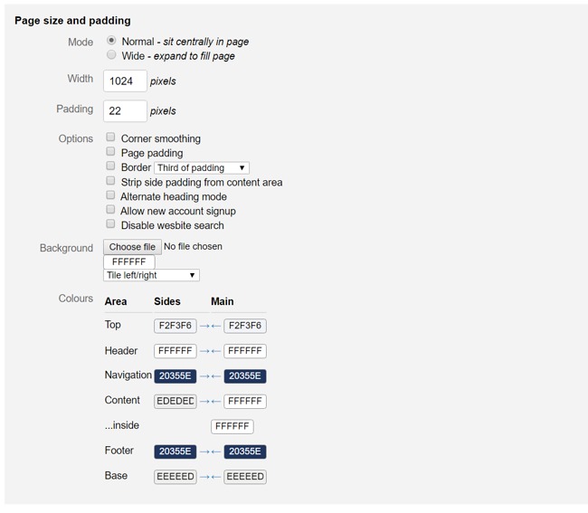
This will set the canvas layout and feel. Below we've explain each of the settings:
Mode:
Normal mode simply means your content will be centralised with a border on either side.
Wide mode is for those seeking to have their site fill the full width of the website.
Width:
This is the width of the content area, normally around 1024px
Padding:
The distance between the border and text.
Options:
Corner smoother - The option to round off the top corners of boxes/widgets.
Page Padding - Adds padding to the top, bottom and sides of the site.
Border - Sets the Page Padding thickness.
Strip side padding from content area - Removes padding from around the content area.
Alternate heading mode - ######### TBC ##########
Allow new account signup - Allows people to create accounts without being prompted.
Disable website search - This disables the website search function.
Background:
You can opt to either have a back ground image or colour. The image can be Tiled by selecting the tiling drop down menu.
Colours:
This controls the base colours throughout the site:
Top - Thin area above the header area.
Header - This is where the logo sits.
Navigation - The navigation bar.
Content - The normal content area.
Inside - The home page content boxes.
Footer - Bottom navigation bar.
Base - Thin area below the footer.
2. Top Bar
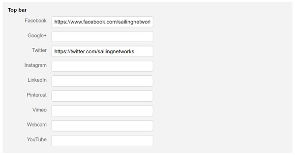
Add your social links so they can appear at the top of your webpage and allow your visitors to track you easily. Simply copy and paste the URL into the correct box.
3. Header

To add a logo simply select "Choose File", browse your files and once the correct file has been selected then press "Open".
You can align it centrally, right, left and over the full width of the header.
4. Menu
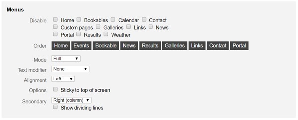
Select and alter what appears on the menu, in what order and the style of it.
Disable:
You can disable some of the functions from appearing on your menu, however they will still be functioning on the CRM desktop.
Order:
Simply drag and drop the pages so they're in the desired order
Mode:
This alters the look of the menu bar and the highlighting/active background. Full will fill the area of that menu item. Padded will add a slight padding to the top and bottom of the bar. Underline will put a line under the menu links. Edged will add an edge to the bar.
Text Modifier:
Choose whether the text is all in capitals, lowercase or None, which will keep it as you have it in each content page.
Alignment: Choose to put the menu in the Centre of the Nav bar, in the left or the right.
Options: Sticky meas the menu bar will stick to the to of the page as the user scrolls down.
Secondary: Refers to the secondary navigation bar on the content pages. Right and left refers to which side of the main content you'd wish to have the menu. Column means the secondary menu will be be in a column formation. Float means the secondary menu will be in a box separate from the edge. Top Pop Down means the pages menu will be a drop down menu.
The dividing line adds a line between each secondary pages.
5. Trail

A Breadcrumb Trail is like a secondary navigation and give you an idea or where about you are in the website and quick links to parent content. They can be found under the main navigation bar and above the page header.
Text:
This refers to the colour of the text
Link:
Choose the colour of the links
Separator:
Add the symbol you want to use to separate the pages/folders. For example add > to look like this: "Parent > Child > Infant"
6. Homepage
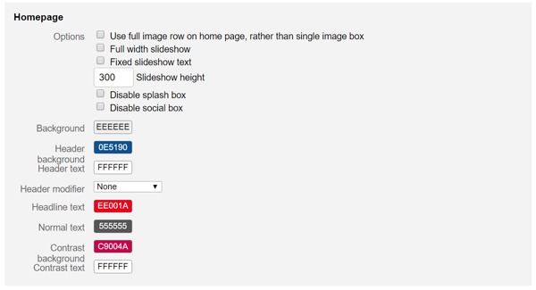
Play around and create a unique looking homepage with these variables.
Use full image row on home page, rather than single image box:
***tbc***
Full width slideshow:
This takes away the text box and adds an image slideshow across the full width of the box area.
Fixed slideshow text:
You can keep the text from your first slideshow while showing the images from the other slides.
Slideshow height:
The Number of pixels you wish the slideshow to be, default is 300.
Disable splash box:
This will turn the slideshow splash box off.
Disable social box:
***tbc***
Background:
This is the background colour of the home page boxes
Header background:
Each box has a header, here you can change that colour so it stands out.
Header text:
Make sure the header colour is readable and not the same as the background. You can change it here.
Header modifier:
Choose whether you with the text to be in standard lower case or all in CAPITALS.
Headline text:
Each box has a title inside the box and you can set the colour of it here.
Normal text:
Pick the colour for the normal text inside the homepage boxes.
Contrast background:
at the bottom of the boxes are links, you can add a different colour to create a contrast.
Contrast text:
Make the bottom link text stand out by adjusting the link text colour.
7. Portal
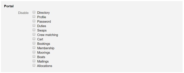
If your website includes a portal then you can edit what sections and pages the customers can see.
8. Fonts
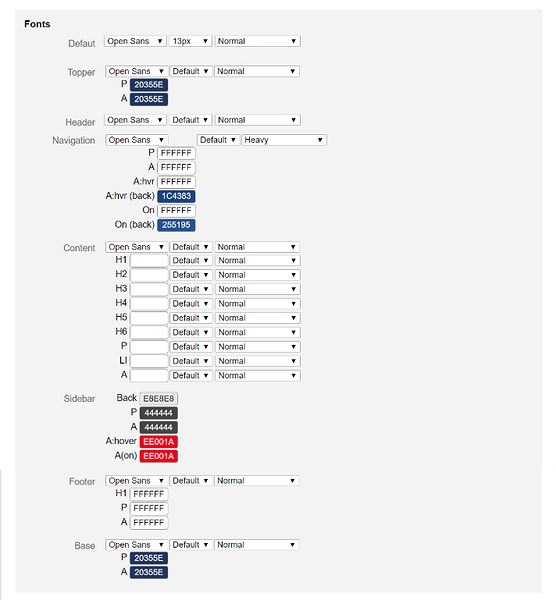
You can edit the fonts, whether it be the colour or style all from here.
Default:
This is the standard font for the content of your site. (Note that the third column Heavy means Bold)
Topper:
This is the text on the top right hand corner of the screen, it might be saying: "Members Login".
Header:
If you don't have a logo and simply have the text then this will control the style of it.
Navigation:
Use this are to edit the look and feel of your Navigation bar text. Below are the acronyms explained:
P - Is a non link piece of text should you have text in the nav bar that isn't a link.
A - This is the standard colour for all the links.
A:hvr - This will change the colour of the link if the cursor is hovering over it.
A:hvr (back) - You can change the background of the link to heighten the feel of contrast between it and other links
On: This is the page the user is currently on.
On (back): Like A:hvr you can set the background of the page you are currently on.
Content:
You can change the look and feel of everything from headers to paragraphs and lists. Below is a list of the style options:
H1
H2
H3
H4
H5
H6
P
- Li (this is a list)
A (this is a link)
Sidebar:
If you have the standard secondary navigation option with links in a sidebar then here you can set the look and feel of that sidebar.
Footer:
Here you can edit the footer nav style
Base:
At the very bottom of the page is a section with your copyright information. You can edit the style of this here.
9. Custom CSS
If you have any custom CSS you wish to enter then it can be done so here.
10. Save

Make sure that you click Save every time you make any changes. Failing to do so means you will loose all the work
Last updated 10:10 on 24 November 2016
